Fundamentals of Color & Visibility for Outdoor LED Digital Smart Displays
When designing content for an Outdoor LED Digital Smart Display, visibility is everything. How your audience perceives color depends on several factors, including color temperature, brightness, pixel pitch, and the surrounding environment. Understanding these fundamentals ensures you choose the right colors for maximum visual impact.
Hue, Value, and Saturation: Each color has three aspects; hue (shade), value (lightness or darkness), and saturation (intensity). Strong contrasts between these improve readability.
- Brightness (NITs) and Ambient Light: Smart Displays must compete with changing daylight. Outdoor models often require 5,000–10,000 nits in full sunlight, while shaded installations may need 500–1,000. An illuminated sign must compete with changing daylight conditions, which is why brightness calibration is critical for maintaining color accuracy and visibility.
- Viewing Angle and Distance: At different angles, color combinations may appear muted. Large pole or stadium displays often use bold, high-contrast tones for long-distance visibility.
- Pixel pitch: The distance between LED clusters, determines how crisp and detailed an image appears. Tighter pixel pitch produces smoother, more vivid images for closer viewing.
These principles of color theory, brightness, and pixel density help determine what color combinations work best for LED sign visibility.
Best Color Combinations & Pairings for Maximum Legibility
Choosing the best color combinations for your Smart Display means finding contrasts that stay readable in all conditions.
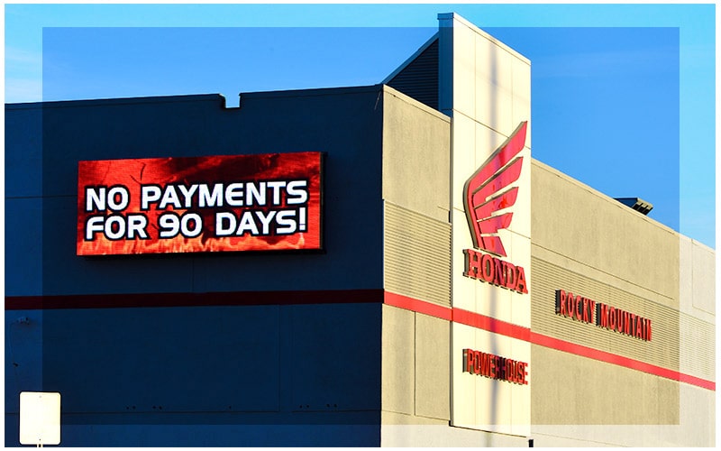
- High-Contrast Wins: Examples include yellow or white text on dark blue or black, or black on white and yellow, classic choices for visibility.
- Avoid Weak Contrast: Pastel on pale backgrounds or dark-on-dark blends hinder readability.
- Borders & Outlines: Use crisp outlines around text to help letters stand out even when using limited color palettes.
- Watch for Vibrating Colors: Complementary pairs like red and green may cause visual strain and reduce readability.
- Accessibility Factors: Account for color psychology and visual differences to ensure everyone can interpret your message clearly.
Thanks to Genoptic’s SMD LED technology, our displays offer over 281 trillion color contrast options with full video capabilities. This unmatched range ensures your visuals are both accurate and vibrant, whether viewed from five feet or fifty.
Brand Identity vs Visibility: Striking the Right Balance
Every brand has specific color choices, but the most effective Outdoor LED Digital Smart Display signage balances identity with visibility.
- Stay True, But Flexible: Use brand colors as the foundation, then reinforce them with bright colors or secondary colors to improve legibility.
- Prioritize Hierarchy: Headlines and key messages should use the best color contrasts, while secondary text can use more subtle tones.
- Strategic Adjustments: Sometimes the right color for signage visibility isn’t a perfect brand match but enhancing it ensures the message still stands out.
Genoptic’s advanced modules do not fade over time, even under direct sunlight. Combined with our DaySensor auto-dimming feature, colors stay vivid and automatically adjust for daytime or nighttime viewing, no manual adjustments required. This not only enhances visibility but also reduces energy costs.
Unlike static print signage, which fades quickly and uses non-landfill-friendly inks, Smart Displays remain bright and environmentally responsible for years.
Our 8 Point Checklist For Smart Display Success
Outdoor LED Digital Smart Displays are effective means of drawing attention and delivering messages in a lively, dynamic manner. Understanding the technical capabilities of outdoor LED displays as well as the fundamentals of good visual communication is necessary to create visually compelling content. For outdoor LED signage, here are some best practices and pointers for producing visually appealing and effective content.
1.Keep It Simple and Clear
Simplicity is key when crafting material for your high-quality LED sign. Your Smart Display only has seconds to grab attention. Use concise language and simple fonts. Avoid clutter and overly detailed graphics. Clarity always wins.
2. Use High-Contrast Colors
Visibility depends on contrast. Dark backgrounds with bright text, or vice versa, maximize readability at any distance.
3. Incorporate Motion Wisely
The ability to include motion into your designs is one of the special benefits of LED signs. Motion draws the eye, but too much can overwhelm. Subtle animations like scrolling text or clean graphic transitions keep content dynamic without distraction.
4. Optimize for Distance and Speed
When creating material for outdoor LED signage, think about how far away your audience will be viewing it and how quickly they will be passing by. Make use of strong, large fonts that are readable from a distance and consider your design from the viewpoint of a moving audience. To make sure that your message can be read quickly, the text and images should have sizes that correspond to the viewers’ distance from the screen.
5. Prioritize Important Information
Sort creative content by putting the most crucial information first. For instance, the name, date, and location of the event should be the most noticeable details if you’re advertising it. You can incorporate more information, but it shouldn’t take away from the main point. The key information is easier for viewers to understand because to this hierarchical method.
6. Test Your Designs
Test your creative content in settings comparable to the ones in which it will appear before putting it in its final form. Always preview your content in conditions similar to where it will be displayed. Pixel pitch, brightness, and ambient light all affect visibility.
7. Stay Brand Consistent
It is imperative to uphold brand consistency while creating material for outdoor LED displays. Utilize the color palette, typefaces, and logos associated with your brand to strengthen coherence and brand awareness across all forms of advertising. Maintaining a consistent brand makes your message more memorable and aids in the development of consumer trust.
8. Leverage the Power of Images
Compared to words alone, images are more successful in evoking emotions and complicated ideas fast. Make use of pertinent, high-quality photos that enhance your message and are designed for LED display. Make sure the pictures aren’t excessively detailed, which could be confusing to look at from a distance, and are instead straightforward enough to understand at a glance.
Maximizing Impact with Smart Displays: Visibility, Maintenance, and Regulatory Compliance
Outdoor LED Digital Smart Displays offer businesses the benefit of enhanced visibility and customer attraction with their bright, dynamic displays, adaptability, and cost-effectiveness, making them a strategic choice for impactful branding and increased sales.
Genoptic Smart Displays feature SMD LEDs that maintain consistent brightness and color accuracy for up to 10 years under our comprehensive warranty. Our modules resist fading and hue shifts that often affect competitor models, ensuring lasting visual consistency.
Effective maintenance and care are essential for the longevity and optimal performance of outdoor LED signs, involving regular cleaning, proper ventilation, electrical checks, and protection against weather, ensuring their continued effectiveness in attracting clients. Meanwhile, the DaySensor auto-dimming system adjusts brightness automatically, preserving color accuracy and saving energy around the clock.
Navigating the regulatory landscape for outdoor LED signs is essential for legal compliance, community relations, and public safety, requiring businesses to understand and adhere to local zoning and legal regulations for responsible and effective advertising.
Mastering Visual Impact: Crafting Compelling Smart Display Content
Designing for Outdoor LED Digital Smart Displays is both a science and an art. By combining visual strategy with Genoptic’s technology, your content can attract attention, convey messages clearly, and drive engagement.
And with Genoptic’s proprietary VideoStar software, anyone, from marketing pros to first-time users, can easily create, schedule, and update vivid content. With intuitive tools and built-in templates, VideoStar makes it simple to bring your Smart Display to life.
Together, smart design principles and Genoptic’s innovation create displays that inspire action and deliver unmatched visual impact.
FAQ: Myths & Common Misconceptions about Color & LED Visibility
Do bright colors always work best?
Not necessarily. While bright colors can stand out, they may fade in direct sunlight if not paired with the right contrast.
Is higher saturation always better?
No. Oversaturated colors can strain the eye or appear harsh on screen. Moderate saturation levels typically appear cleaner on digital displays.
Are pastel colors always a poor color choice?
Not always. When used with the right contrast, they can be effective, especially on Genoptic Smart Displays, where SMD LEDs preserve color fidelity even in strong sunlight.
What’s the difference between hue and color temperature?
Hue refers to the basic color (red, blue, green). Color temperature measures how warm or cool the LED light appears, which influences how different colors render. Genoptic’s DaySensor automatically optimizes brightness and color temperature for ideal viewing conditions.
Do complementary colors from the color wheel always increase visibility?
Not always. Some combinations can clash. Use defined outlines instead of shadows or fades to separate colors cleanly and improve readability.
How can I create great-looking content without design experience?
Genoptic’s VideoStar software empowers any user to design, schedule, and manage engaging Smart Display content quickly, no advanced design training required.